A menu is targeted not just at your stomach, but also to your mind.
Smart restaurant owners and chefs use menu psychology to suggestively sell from their menu pages. They use design, placement, and words to direct your attention to key items on their menus so it’s more likely that you’ll notice, remember, and order what they’ve pointed you toward.
There’s nothing wrong with ordering something that’s going to make money for a restaurant, but wouldn’t you like to feel that the selection is purely your choice rather than the restaurant nudging you in the direction of certain choices?
Here are 10 tips to help you make sure the choice is yours:
(These tips are a summary of the tips given in the seven preceeding blog posts in this series.)
- A menu’s design should be in sync with the restaurant’s concept and image — the décor, service, food quality, and price range — and give you an idea about the overall dining experience you can expect.
- You’ll likely find a restaurant’s most profitable items or specials — the things they want you to order — on the top right of the front page of a two-page menu or the top half of the page on a single page menu.
- “Eye magnets” like colored boxes, larger fonts, and icons or symbols are used to help direct your gaze.
- Where a menu item is positioned in a list could shout “order me” or “I’m just a complacent placeholder.”
- High profile real estate is probably filled by high-margin items – the ones that make the most money – or signature dishes, specialty dishes that keep you coming back for more.
- Descriptive menu labels, especially those that evoke nostalgia, yank your chain – and can boost sales by as much as 27%.
- A menu can make you feel like you’d be crazy to pass up an item with a mouth-watering description by toning down the descriptions of competing choices. The competition still might be good — it just doesn’t sound as great as the dish the restaurant wants you to order.
- Really expensive items act as decoys when they’re put next to others that are more reasonably priced – pushing you to order what then looks reasonably priced — but still may be expensive.
- Don’t look for dollar signs on the menu. They’re not there because they act as a subconscious reminder that you’re about to part with your hard earned money. Restaurants don’t want you to think about money when you order.
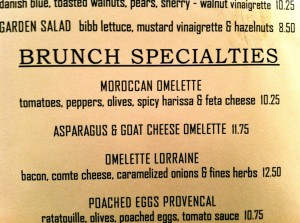
- Prices are usually listed right after a dish’s description rather than lined up in straight right-adjusted column. This keeps you from scanning down the list to find the least expensive items. Remember – restaurants don’t want you to think about your wallet – so a menu will use ways to eliminate easy price comparison.
Do you eat out? This is the eighth article in a series of consecutive posts about decoding restaurant menus. Keep checking back for more information that might help you with your restaurant choices.
Please share if you know anyone who wants to Eat Out and Eat Well!
Remember to LIKE Eat Out Eat Well on Facebook (the LIKE button is under the five spoons).


