 Supermarkets have your shopping experience down to a science and they arrange and display their merchandise to artfully encourage you to buy more products.
High Shelf Or Low Shelf?
Ever hear something described as “top shelf”? That usually means the really good or the most expensive stuff. In supermarkets, where products are placed can send subtle signals that affect your purchase decision. The most expensive products generally are on the highest or top shelves. Lower shelves house “destination” products — the ones you need, look for, and will buy regardless of price. The bottom shelf has the least popular or generic products (where’s the flour and sugar in your market?). Eye level shelves, known as “reach,” hold high impulse purchases, products that are competitive, or ones that are the most enticing.
What They Want You To Buy
If you’re used to seeing products in free-standing bins, on shelves, or on end caps (the shelves at the very end of aisles in the market you frequent), you’ll end up usually checking them out for specialties or bargains. The products on or in them are promoted products that probably have the highest profit margin for the store, are items with the lowest price, or they have a big manufacturer’s promotion like a coupon or reduced price. “Dump bins” or “offer bins” usually are a jumble of items being closed-out and seem to uniformly signal “cheap price.” Can you honestly say that you can easily walk by big bins or specialty displays without at least looking?
A Crazy Quilt Of Fruit and Vegetables
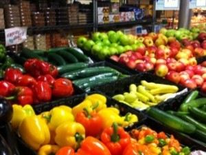
In the produce departments, the displays of green vegetables are usually alternated with brightly colored produce. The crazy quilt of beautifully colored fruits and vegetables is designed to draw your eye.
In Whole Foods, for instance, you’re instantly hit with what they want you to see/buy/eat. Produce is right up front, arranged by shades of color, and displayed in black bins so the produce color really stands out and draws your attention. According to a retail consultant, they’re priming you – giving you the impression that what you see is as fresh as possible – that way you’re prepared to spend more.
Why Are The Milk And Eggs In The Back Of The Store?
People go to the market to buy lots of things – but most frequently for destination purchases like milk, eggs and bread. In many markets those destination purchases are in the farthest corner of the store. Why? The more items you have to walk by to get to the destination purchase – the milk, bread, eggs — the more opportunity and the better the chance you’re going to buy other things that you walk by that suddenly you absolutely must buy. That’s the same reason impulse purchases like magazines, gum, and candy are near the cash register. Wile you wait to pay for the items in your cart the display or impulsive buys may entice you to toss one or two onto the checkout counter (the low level displays also entice kids to grab candy from them and more often than not, to avoid a scene, parents give in).
Is There A Café Up Front?
Some markets now have a cafe or place to sit and eat the food you have purchased. In many Whole Foods the eating areas are very near the entrance. A branding design expert says the intent is to get you in the mood for shopping. As soon as you walk in and you see other people enjoying the products that you can buy and then eat, it gives you incentive to purchase and eat them, too.
The Size Of Your Shopping Cart
Have you seen the size of some of the shopping carts – especially in the bigger or newer stores where there are nice wide aisles? Or, how about the stores with kid size carts, too? You end up filling – and buying – an adult sized (perhaps oversized) cart’s worth of groceries and a kid-sized cart of groceries, too. How many adults can tell a child that they aren’t going to buy what the child has put into his or her own cart?
A retail consultant’s firm calculated that increasing the size of shopping baskets can boost a store’s revenue by up to 40% — the reason that over the past three years Whole foods has increased the size of its shopping baskets.
Is There Music In The Air?
From a branding design expert: hearing old favorite songs in a store helps you form a quick emotional bond with the store – the feeling that the store “gets you.” In Whole Foods you very likely might hear hits from the ‘80s and ‘90s. Don’t you have a tendency to buy more when you’re relaxed and in a comfortable atmosphere?
A Colorful Bonus Tip
What color are the sales stickers on your merchandise? Mostly yellow and red? Here’s why: yellow and red signs and stickers elicit the biggest consumer response. So, heads up – especially when you see a nice red or yellow sale sticker stuck on something – it might end up in your cart!


